Context
In my previous post, I set out a challenge for myself to walk through the quickstart documentation for MLflow, a commonly used free and open source MLOps platform, and demonstrate how I could incorporate it into a solo or small-team data science project. How quickly would structuring my workflow around this pay off in terms of scalability, maintainability, and otherwise keeping my sanity if the project were to run for a long time? Or, is this framework overkill or inappropriate for these kinds of projects?
Here, I’ll set up a small demonstration machine learning project that resembles ones I’ve seen professionally, often with one or a few data scientists actively contributing. In fact, I’ve seen projects like this deliberately scoped to just one active contributor because the MLOps processes and tooling in place can’t gracefully handle more collaborators!
The question
Good data science projects start with a clearly defined problem statement. The specific problem behind this demo project is not that important, but ideally would have a few characteristics:
- Data is publicly accessible and easy to use
- Size of the dataset can be adjusted depending on what scale is most convenient for the demo
- Problem domain is interesting to me, and not so complicated to explain
- Easy to formulate as a machine learning problem, and amenable to mainstream modeling techniques but not trivial to model perfectly
There’s a candidate I have in mind already…
What will system electricity demand be in CAISO for the next 24 hours?
CAISO is the transmission system manager for wholesale electricity in the state of California. It is responsible for day-to-day operation of the transmission lines, including administering wholesale energy markets and planning projects to improve statewide power grid reliability. Suffice it to say that predicting the upcoming aggregate demand for electricity is of core importance for CAISO; in fact, it already publishes high-quality hour-ahead and day-ahead forecasts that I can benchmark against! This challenge fits all of the criteria above and suggests a nice, self-contained time series forecasting exercise.
Data collection
I will focus on one particular report that CAISO publishes, the production and curtailments data. Each file available here contains time series of the systemwide aggregate reported demand, generation and curtailment in megawatts (MW) at five-minute resolution. Let’s scope the problem to column D, “Load”, which represents the electricity demand across the CAISO system.
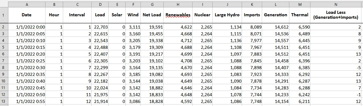
The readme sheet of the file helpfully notes that these are aggregates of raw reported data, and “is not considered operational or settlement quality”. That’s fine for the purposes of this exercise.
Extracting just the aggregate load data into a combined file for all years is straightforward:
Code snippet
```python    import pandas as pd    from pathlib import Path
    dir_data = Path("...")    years = range(2018, 2025)
    list_dfs = []    for year in years:        print(year)        list_dfs.append(            pd.read_excel(                io=dir_data.joinpath(f"ProductionAndCurtailmentsData_{year}.xlsx"),                sheet_name=1,                index_col=0,                usecols=[0,3],                parse_dates=True            )        )
    df = pd.concat(list_dfs, axis=0)```
As an aside, the preferred portal for CAISO-related data is OASIS, and this data at finer geographic/nodal resolution can be downloaded here as well. This is also where I will pull the in-house demand forecasts for benchmarking purposes.
Before starting any other analysis, I need to identify what timezone the observation interval index has. Unfortunately this isn’t documented in the original files’ readme sheets. However, we can infer that this is local California time, both daylight savings and standard, because:
- Each year has 02:00-02:55 missing on the date that daylight savings begins in the spring.
- Each year has duplicate records for 01:00-01:55 on the date that daylight savings ends in the fall.
- The region of interest (CAISO territory) is Pacific timezone only.
To correct for this, I localize the timezone to America/Los_Angeles then convert to UTC:
df = df.tz_localize("America/Los_Angeles", ambiguous="infer").tz_convert("UTC")Then I reindex to the desired regular 5-minute frequency to reveal any missing observations:
df = df.reindex( pd.date_range( df.index[0], df.index[-1], freq="5T", tz="UTC" ) )Exploratory data analysis
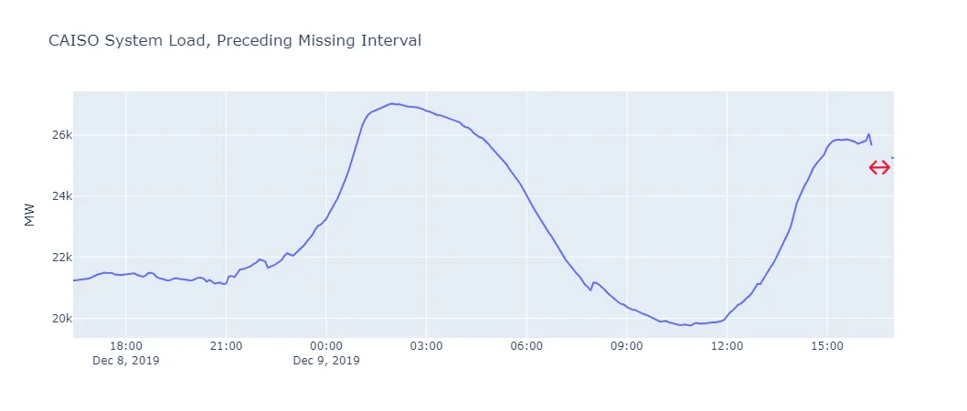
count 736410mean 25321.27std 4813.61min 14666.4825% 21924.9350% 24395.3775% 27218.22max 61564.08After converting the time index to UTC, there are no duplicate records. However, there are 6 (contiguous!) missing observations representing 2019-12-09 16:25 through 2019-12-09 16:50 UTC. I should be able to interpolate these.
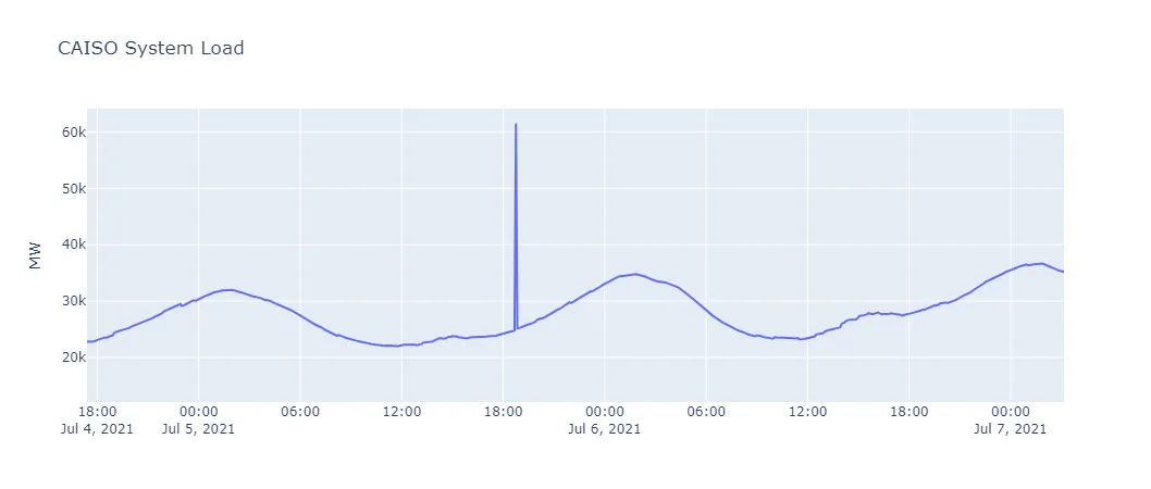
There is one outlier observation, at 2025-07-05 18:45 UTC, which is a clear break from trend. I will null this out and interpolate as well.
Seasonality and trend
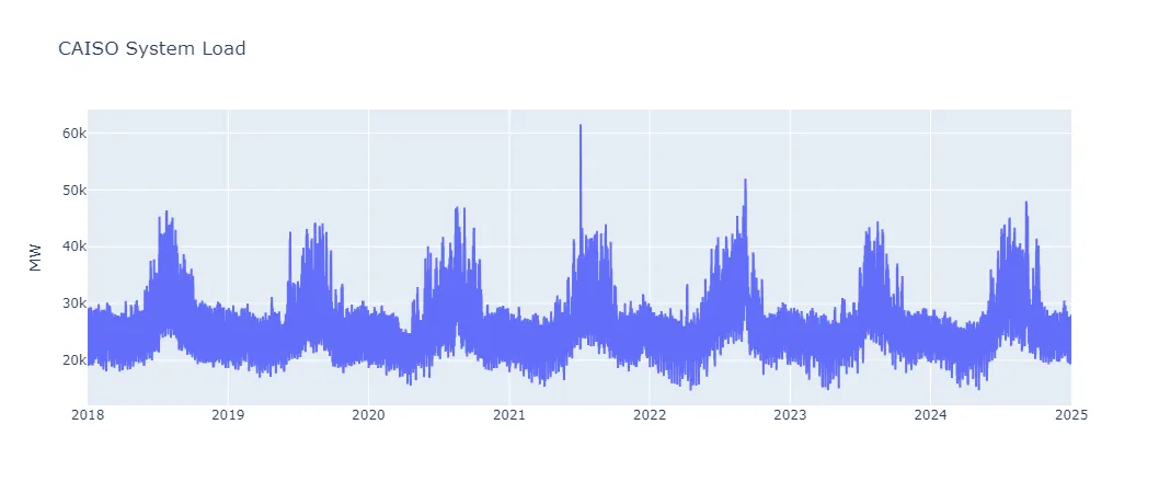
Naively, I would expect systemwide load to have daily, weekly, and annual cycles. A quick high-level view of the raw time series reinforces this:
With several years of five-minute interval records, this dataset is too large to naively perform seasonality/trend decomposition analysis (e.g. statsmodels.tsa.seasonal.seasonal_decompose, statsmodels.tsa.seasonal.MSTL) or estimate autocorrelation / partial autocorrelation functions for lags up to order, say, (e.g. statsmodels.tsa.stattools.acf, statsmodels.tsa.stattools.pacf). Instead, let’s do the following:
- Assume a linear model for the system load as a function of the seasonal lag(s) plus and intercept, for example . For each seasonal lag added (daily, weekly, annual), plot the model predictions and the residual.
- Assume that after correcting for seasonality by subtracting out the weighted lags, any dependence the residuals have on either previous values or error terms (i.e. AR or MA terms) are limited to the last 24 hours. Plot the ACF and PACF of the first lags for the residual of the seasonal linear model.
Note that eventually, I will experiment with other ways of incorporating seasonality in the the models. I suspect that there’s a confounded effect between calendar date/time and, say, solar irradiance: electricity usage will depend not just on what the clock says (e.g. work shifts, TV schedules) but also on the amount of daylight (e.g. automated street or stadium lights) and this will be correlated with ambient temperature too. Since this project is just for demonstrating MLflow, though, I don’t want to get too carried away with incorporating external data as features.
Here are the predictions and residuals for the simple seasonal lag model, by cycle length, after removing the one outlier:
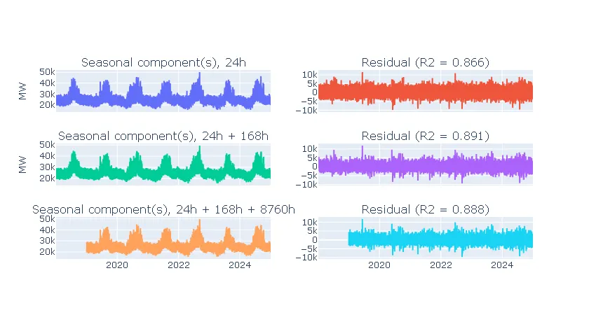
Note that (not adjusted!) is slightly higher for daily & weekly seasonality than when also adding in annual lags. That is, as much as 89.1% of the variation in the dataset is attributable to the daily and weekly cycles.
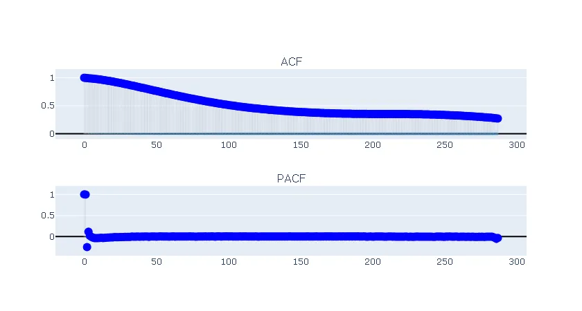
Due to the large sample count, the 95% confidence interval for the ACF and PACF plots is tight enough to not be very useful. However, I still interpret these plots, and the decay over lags, to suggest that the residual could be modeled as an AR(2) process.
Where does MLflow fit in?
In the next post, I’ll show what an example test harness for forecasting this would look like. In particular, it should make it easy to standardize experiments and compare results across independent users - and that will mean taking advantage of MLflow functionality!